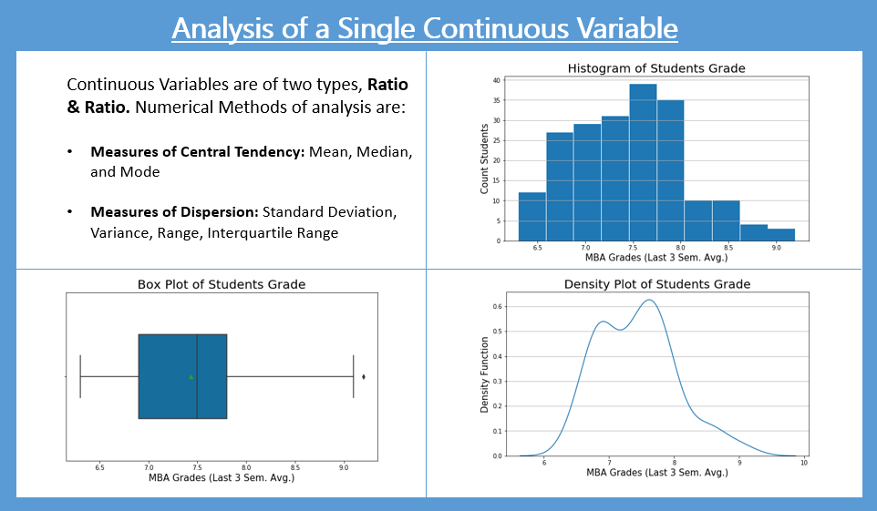
Analysis of Single Continuous Variable
Histograms are a great way of analyzing a single continuous variable. The histogram is an approximate representation of the distribution of numerical data. It is created by converting a continuous variable into categorical by binning/bucketing, i.e. dividing the range of values in the variables into intervals, called class-intervals. The histogram plot is made by having the X-axis represent the class-intervals and the Y-axis represent the class-interval frequencies. The other ways of visually presenting a single continuous variable are Density Plot and Box Plot.
Mean is the most used measure to summarize a single continuous value. The other summary statistics often used are Median, Standard Deviation, Range, Min, Max, Interquartile Range.
Analysis of the MBA Grades
Let’s analyze the mba_grades of the students. The field “mba_grades” in the “MBA Students” data is a Continuous Variable
Data Import
Numerical Methods to summarize a Single Continous Variable
Let’s write some code to get the Mean, Median, Min, Max, and Standard Deviation measures.
Graphical Methods to analyze a Single Continous Variable
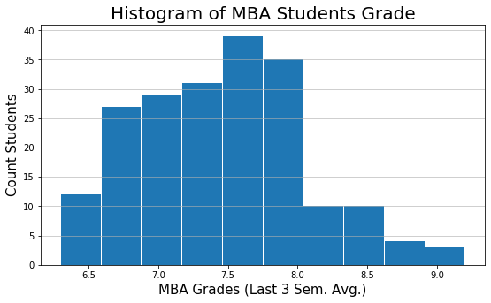
Histogram
plt.figure(figsize=(9,5))
plt.hist(mba_df['mba_grades'], rwidth = 0.98)
# rwidth parameter is relative width.
# It has been used to get spacing between the bars

plt.title('Histogram of MBA Students Grade', fontsize=20)
plt.xlabel('MBA Grades (Last 3 Sem. Avg.)', fontsize=15)
plt.ylabel('Count Students', fontsize=15)
plt.grid(axis='y', alpha=0.75)
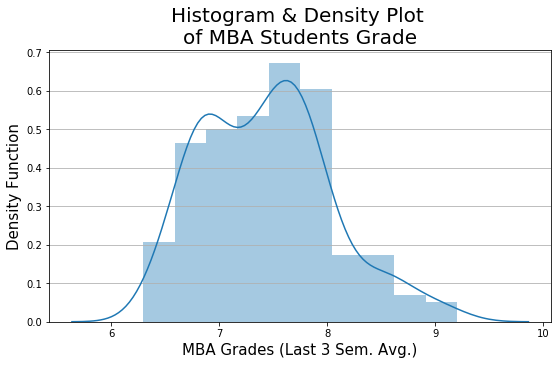
Density Plot
plt.figure(figsize=(9,5))
sns.distplot(mba_df['mba_grades'],
             hist = True, bins=10,
             kde=True, color='#1F78B4'
            )
## KDE stands for Kernel Density Estimate

plt.title("Histogram & Density Plot \nof MBA Students Grade", fontsize=20)
plt.xlabel('MBA Grades (Last 3 Sem. Avg.)', fontsize=15)
plt.ylabel('Density Function', fontsize=15)
plt.grid(axis='y')
Box Plot
Box plot helps us quickly find outliers in data.
plt.figure(figsize=(9,5))
sns.boxplot(x='mba_grades',
                 data=mba_df, showmeans=True,
                 width=0.5,
                 palette="colorblind")
plt.xlabel('MBA Grades (Last 3 Sem. Avg.)', fontsize=15)
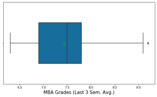
From the Box Plot below, we can see that there is an outlier value. In this case, the outlier is on higher suggest. The interpretation of the outlier in this example will be, that, there is one student who has performed exceedingly well in comparison to all others.
Interpretation of Box Plot
The Box Plot is also called a Box and Whisker Plot. The Box Plot is used to represent the data in a five-point summary statistics: Minimum, Q1, Median (Q2), Q3, Maximum.
The inside box of the Box Plot represents Q1, Q2, Q3. The endpoints of the Box Plot whiskers represent LCL and UCL.
- LCL: Lower Control Limit. It is typically calculated as Q1 – 1.5 * IQR
- UCL: Upper Control Limit. It is typically calculated as Q3 + 1.5 * IQR
- IQR is Interquartile Range. IQR = Q3 – Q1
- Outliers are values that are beyond the LCL and UCL range. In the Box plot, the outliers are represented dot above UCL or below the LCL range.
The green dot in the Box Plot above indicates the Mean. It is optional.
Tabular Methods: Percentile Distribution
# Get the percentile distribution of the students grade
mba_df['mba_grades'].quantile([0,0.01,0.05,0.1,0.25,0.5,0.75,0.9,0.95,0.99,1])
0.00    6.300
0.01    6.500
0.05    6.500
0.10    6.790
0.25    6.900
0.50    7.500
0.75    7.800
0.90    8.200
0.95    8.600
0.99    9.001
1.00    9.200
Name: mba_grades, dtype: float64
Inferences / Take away
We can make the following inferences by seeing the above Descriptive Statistics output:
- The Mean grade of the students is 7.4 and the Standard Deviation is 0.6
- The Histogram shows that there is not much dispersion in the grades of the students.
- The middle 50% of the students are between grade 6.9 to 7.8
- Top 10% of the students have grade above 8.2
Note: Interquartile range is also called the middle 50%.
Practise Exercise
Analyze the 12th Standard percentage marks of the MBA Students. This information is provided in the variable “ten_plus_2_pct”.
Next Blog
In the next blog, let’s learn “Analysis of two variables”:
- One Categorical and other a Continuous variable
- Both Categorical
- Both Continuous
<<< previous | next blog >>>
<<< statistics blog series home >>>
Recent Comments