So Far in our earlier blogs, We have discussed the Analysis of Single Continuous Variable, Analysis of Single Categorical Variable, Analysis of Two Continous Variables, and Analysis of Two Categorical Variables. In this blog, we will learn the Analysis of Two Variables(One Continous, One Categorical).
The most common Descriptive Methods to analyze two variables(One continuous, One Categorical) are in the above table. Let’s take one continuous Variable and one categorical Variable From ‘Our MBA Students’ and Analyze them.
Before Analyzing two Variables, Analyze both the Variables Individually. We will Leave This as a Practise as we already discussed the analysis of single continuous and single Categorical variables in our previous blogs.
Recategorize all the Students’ 12th Standard Stream into two categories. i.e., Science and Commerce.
#Output / Tabular Report
Interpretation
IIn the above output table, We have taken two Important measures, Sum and Mean.
Analysis of Two Variables | One Categorical and Other Continuous
|
Analysis of Two Variables | One Continuous and Other Categorical |
|
|
Tabular Method |
Formulate Table by aggregating the Continuous Variable (i.e., Like Sum, Count, Mean) with its corresponding category in the categorical Variables. |
|
Graphical Method |
Box Plot |
Importing MBA Students in R
First, Let’s Import MBA Students Data in R. The R programming Code to Import ‘MBA Students Data’ is given in the table below:#Set directory as per your folder file path setwd("D:/k2analytics/datafile") getwd() #Read the File mba_df = read.csv("MBA_Students_Data.csv", header = TRUE)
12th Standard Stream Vs Working Experience in Months.
|
Variable |
12th Standard Stream |
Work Experience in Months |
|
Variable Name |
ten_plus_2_stream |
work_exp_in_mths |
|
Description |
This Variable describes the 12th Standard Stream of the Students. Like Science or Commerce. |
This Variable describes the working experience of Students in months. |
|
Variable Type |
Categorical |
Continuous |
Data Preparation
The Work Experience in Months Variable Contains NA. Let’s replace them with 0. Let’s Assume they have no prior working experience.#Data Preparation mba_df$work_exp_in_mths[is.na(mba_df$work_exp_in_mths)] = 0
#Recategorizing
ten_plus_2_stream_recat = function(x){
  x = toupper(x)
  if (grepl("COMMERCE",x)){
    return ("COMMERCE")
  }
  else{
    return ("SCIENCE")
  }
}

#Recategorizing ten_plus_2_Stream
mba_df$ten_plus_2_stream_recat = lapply(mba_df$ten_plus_2_stream, ten_plus_2_stream_recat)

# Converting List to Vector
mba_df$ten_plus_2_stream_recat = as.vector(unlist(mba_df$ten_plus_2_stream_recat))
Tabular Report
The Easiest Way to Analyze the Categorical and Continuous Variables is to create a Tabular Report. ‘R code’ to create a Tabular Report is given in the below table:#Aggregating aggr = aggregate(mba_df$work_exp_in_mths,by=list(mba_df$ten_plus_2_stream_recat), FUN=function(x) c(count = round(length(x)), sum = round(sum(x)), mean = round(mean(x),1))) #Renaming Columns colnames(aggr) = c("stream","work_exp") print(aggr)
    stream work_exp.count work_exp.sum work_exp.mean
1 COMMERCE          126.0        1250.0           9.9
2  SCIENCE           74.0        1237.0          16.7
- Based on the sum of the Working Experience of the students. When Combined, Commerce Student has More Work Experience than Science Students.
- Based on the mean of the Working Experience of the students. When combined, Science Student has More Work Experience than commerce Students.
- In this Scenario, The Mean makes more sense than the Sum. Hence, This is Important for the Data Analyst to choose the best Aggregation Measure.
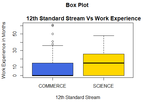
Graphical Methods | Boxplot
Boxplot quickly shows the distribution of the data in the variable. It also helps to find outliers. Boxplot is one of the most common methods to visualize the continuous variables by its corresponding category. The ‘R code’ to Create a box plot is given below:boxplot(mba_df$work_exp_in_mths~mba_df$ten_plus_2_stream_recat, xlab = "12th Standard Stream", ylab = "Work Experience in Months", main = "Box Plot \n 12th Standard Stream Vs Work Experience", col = c("royalblue","gold"))
Interpretation
Form the Above Box Plot We can Interpret,- The Average prior Working experience of Science Students(17 months) is getter than Commerce Students(10 months).
- The third quartile(Q3) of the working experience of Commerce students is very close to the median(Q2) of the working experience of Science students.
- The boxplot shows There are outliers in the working experience of the Commerce Students. Since it is the Working Experience of the Students it cannot be considered as an Outlier. i.e., Few Commerce Students have relatively more Working Experience than Othe Commerce Students.
Practise Exercise
- Analyze the MBA Specialization with the MBA Grades.
- Analyze the MBA Specialization with the Graduation Percentages.
Recent Comments