Preread
Descriptive Statistics is performed using tabular, graphical, and numerical methods. We have already covered the Numerical Methods in earlier blogs. Moreover, in our Exploratory Data Analysis blog, we mentioned that Tabular & Graphical Methods are important tools to perform EDA. In this blog, we will now focus on the Tabular and Graphical Methods. It is also important that you have a fair understanding of “Types of Variables” before proceeding with this section.
Tabular and Graphical Methods
Tabular Methods are used to summarize the data in table form. It is a systematic organization of information in grid row and columnar structure. The most frequently used tabular format for data summarization is Frequency table and Cross-tabulation
Graphical Methods are a visual way of presenting data using charts and graphs. The visuals make the data intuitive and self-understandable. The most frequently used visual representation of data are Bar Plot, Histogram, Pareto Chart, Box Plot, Pie Chart, Line Plot, and Scatter Plot.
Descriptive Analysis of MBA Students Data
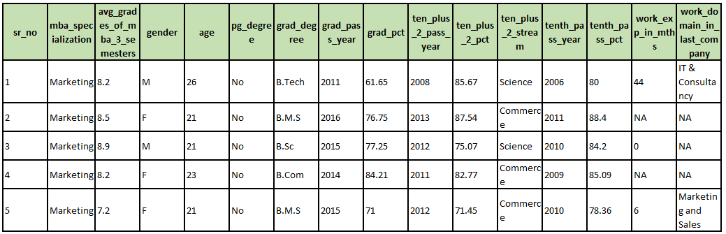
Assume you are appearing for a Data Science job interview. As part of their evaluation process, the company has asked you to perform Descriptive Analysis using Tabular & Graphical Methods on a dataset containing 200 MBA student records. The dataset has 16 variables and 200 observations. You can download the datafile Mba_Students_Data.csv from our website (Download Link).
You can use Python/R programming tool for performing the analysis.
The first five records of the MBA Student Data Set is given below:
How to do the Descriptive Analysis?
The way descriptive analysis is done is to start simple; analyze one variable at a time (Univariate Analysis). Then proceed to check the association/relation between two or more variables (Bivariate and Multivariate Analysis). The table below provides the guidelines:
| Variable | Descriptive Analysis to perform |
| Only One Categorical Variable
(know more… with Python/R code) |
|
| Only One Continuous Variable
(know more… with Python/R code) |
|
| Two Categorical Variables
(know more… with Python/R code) |
|
| Two Continuous Variables
(know more… with Python/R code) |
|
| One Categorical and One Continuous Variable
(know more… with Python/R code) |
|
| Time and a Continuous Variable
(know more… with Python/R code) |
|
Commonly Used Graphical Plots
The table below explains the commonly used plots and their usage.
| Plot Type | Variable Type | Description |
| Bar Plot | Only One Categorical Variable
Or One Categorical Variable & One Continous Measure |
A bar plot is a chart that presents categorical data with rectangular bars with heights or lengths proportional to the values that they represent.
Visually represents frequency distribution. |
| Stacked Bar Plot | Two Categorical Variables | A stacked bar chart, also known as a stacked bar graph, is a graph that is used to break down a category by another category and compare parts of a whole.
Each bar in the chart represents one category as a whole, and segments in the bar represent different parts or categories of that whole. Visually represents cross-tabulation data. |
| Histogram | Only One Continuous Variable | A histogram is an approximate representation of the distribution of numerical data. It is created by converting a continuous variable into categorical by binning/bucketing it. |
| Distribution Plot (Density Plot) | Only One Continuous Variable | A density plot is a representation of the distribution of a numeric variable. It uses a kernel density estimate to show the probability density function of the variable. It is a smoothed version of the histogram
Visually shows Skewness in data. |
| Box Plot
(Box and Whisker Plot) |
Only One Continuous Variable
Or One Continuous & One Categorical Variable |
The box plot is a standardized way of displaying the distribution of data based on the five-number summary: minimum, first quartile, median, third quartile, and maximum.
The Minimum and Maximum in box-plot are Lower Control Limit (LCL) and Upper Control Limit (UCL). Any data point beyond the LCL or UCL is typically considered as an outlier. Quickly helps find outliers in data. |
| Line Plot | One of the dimension has to be Time and the second dimension a Continuous Variable | A line plot is a type of chart that displays information as a series of data points called ‘markers’ connected by straight line segments.
Visually shows trends in Time Series Data. |
| Scatter Plot | Two Continuous Variables | A graph in which the values of two variables are plotted along two axes. The pattern of the resulting points on the plot visually depicts the existence of Correlation between the two variables.
Quickly helps find Correlation. |
| Pie Chart | One Categorical Variable associated with a Continuous Measure | A pie chart is a circular statistical graphic, which is divided into slices to illustrate numerical proportions. Quickly helps compare parts of a whole. |
Next Blog
Let’s analyze “MBA Students” data and derive inferences. Moreover, we will learn to make these plots in Python and R.
Recent Comments