Analysis of Single Continuous Variable
In our earlier blog, we learned to analyze a Single Categorical Variable in R. In this blog, we will Analyze a Single Continuous Variable in R. The below table summarizes the commonly used Descriptive Statistics to Analyze a Single Continuous Variable.
| Tabular Methods | Percentile Distribution |
| Graphical Methods | Histogram, Density Plot, Box Plot |
| Numerical Methods | Measures of Central Tendency and Measures of Dispersion |
Example
We will continue with our same data MBA Students Data used in our previous blog.
Let’s analyze the continuous variable ‘MBA Grades’ in MBA Students Data through Numerical, Graphical, and Tabular Methods.
Analysis of MBA Grades
| Variable Name | avg_grades_of_mba_3_semesters |
| Description | This variable captures the Average of the Grades secured by students in their First Three Semesters |
| Variable Type | Continuous Variable. |
Ok!!! Great. Let us run some R code to analyze our data.
Importing MBA Students Data in R
#Set directory as per your folder file path
setwd("D:/k2analytics/datafile")getwd()

#Read the File

mba_df = read.csv("MBA_Students_Data.csv", header = TRUE)
Numerical Methods | Summary Statistics
R Programming Code to get the Summary Statistics of MBA Grades is given below
#Summary statisitcs
missing_count = round(is.na(mba_df$avg_grades_of_mba_3_semesters))
grades_mean = round(mean(mba_df$avg_grades_of_mba_3_semesters),2)
grades_median = round(median(mba_df$avg_grades_of_mba_3_semesters),2)
grades_min = round(min(mba_df$avg_grades_of_mba_3_semesters),2)
grades_max = round(max(mba_df$avg_grades_of_mba_3_semesters),2)
grades_std = round(sd(mba_df$avg_grades_of_mba_3_semesters),2)

#Print the Values
cat("The Number of Missing Observations is", missing_count )
cat("The Mean Grade of the Students is", grades_mean)
cat("The Median Grade of the Students is", grades_median)
cat("The Minimum Grade of the Students is", grades_min)
cat("The Maximum Grade of the Students is", grades_max)
cat("The Standard Deviation of the Grade of the Students is", grades_std)
#Output
The Number of Missing Observations is 0
The Mean Grade of the Students is 7.43
The Median Grade of the Students is 7.5
The Minimum Grade of the Students is 6.3
The Maximum Grade of the Students is 9.2
The Standard Deviation of the Grade of the Students is 0.6
#Note: For Continuous Variables, Mean is the most important Measure of Central Tendency
Numerical Methods | Percentile Distribution
The Percentile is a measure that represents the percentage of observations that are below a certain value in the data distribution. e.g.
- In the percentile distribution below, the value 6.79 is at the 10th percentile, i.e., 10% of the values in the data are less than 6.79
- the value 7.5 is at the 50th percentile, i.e., 50% of the values in the data are less than 7.5
#Percentile Distribution
transform(quantile(mba_df$avg_grades_of_mba_3_semesters,
                   c(0,0.01,0.05,0.1,0.25,0.5,0.75,0.9,0.95,0.99,1)))
| Percentile | Value |
| 0% | 6.300 |
| 1% | 6.500 |
| 5% | 6.500 |
| 10% | 6.790 |
| 25% | 6.900 |
| 50% | 7.500 |
| 75% | 7.800 |
| 90% | 8.200 |
| 95% | 8.600 |
| 99% | 9.001 |
| 100% | 9.200 |
Graphical Methods | Histogram
- Histogram is the commonly used method to visually show the distribution of the continuous variable
- Histogram is created by converting the range of continuous variables into categories by Binning/Bucketing, i.e., converting the range of values into Intervals, called Class Intervals.
- The X-axis of the Histogram represents the Class Intervals, and the Y-axis of the Histogram represents the Frequency of Class Intervals.
Default Histogram generated by R
#Default Histogram generated by R Programming
hist(mba_df$avg_grades_of_mba_3_semesters,
     breaks = 10,
     col = "royalblue",
     main = "Histogram of MBA Students grades",
     ylab = "Count Students",
     xlab = "MBA Grades (Last 3 Sem.Avg.)")
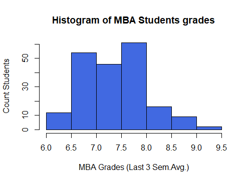
Note: In the above R code we passed the parameter breaks = 10 to create 10 bins. However, the internal logic of the histogram in R has created only 7 bins. It divides the breakpoints into some pretty values as you can see the breakpoints are at an interval of 0.5.
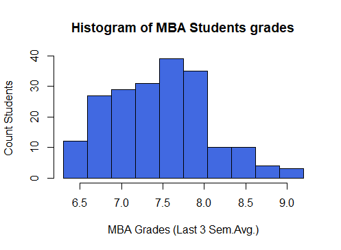
Customized bin size in the histogram
- Total Number of Bins: The total number of class-intervals in the histogram. Let’s create 10 bins.
- Range: The range of average grades of MBA Students is Range = 9.2 – 6.3 = 2.9
- “Bin Width” is obtained by dividing the range by the total number of bins. Bin_width = 2.9 / 10 = 0.29
#Total Number of Bins
total_bins = 10
cat("Total Number of bins is", total_bins)
#Range
grades_range = grades_max - grades_min
cat("The Range of the MBA Students grades is", grades_range)

#Bin Width
bin_width = grades_range/total_bins
cat("The Bin Width is", Bin_width)

#Breaks
bin_breaks = seq(grades_min, grades_max, bin_width)
cat("The Breaks are", bin_breaks)
#Output
Total Number of bins is 10
The Range of the MBA Students grades is 2.9
The Bin Width is 0.29
The Breaks are 6.3 6.59 6.88 7.17 7.46 7.75 8.04 8.33 8.62 8.91 9.2
Let’s plot a Histogram using these breakpoints
#Histogram with optimized bin size
hist(mba_df$avg_grades_of_mba_3_semesters,
     breaks = bin_breaks,
     col = "royalblue",
     main = "Histogram of MBA Students grades",
     ylab = "Count Students",
     xlab = "MBA Grades (Last 3 Sem.Avg.)")
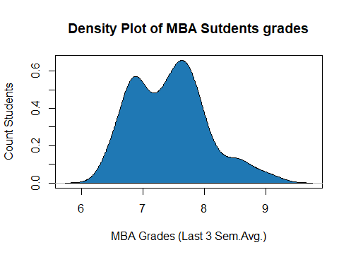
Graphical Methods | Density Plots
The density plot is the graphical representation of the Continuous Variables. The ‘Density curve’ is drawn by determining the probability density function of the Continuous Variable by using Kernal Density Estimate.
#Density plot for average grades of MBA Students
density_grades = density(mba_df$avg_grades_of_mba_3_semesters)
plot(density_grades, frame = TRUE, col = "royalblue",
     main = "Density Plot of MBA Sutdents grades",
     ylab = "Count Students",
     xlab = "MBA Grades (Last 3 Sem.Avg.)")
polygon(density_grades, col="#1F78B4")

Graphical Methods | Boxplot
- A Boxplot is constructed from the five-number summary, viz, Minimum, Maximum, First Quartile(Q1), Median (Q2), Third Quartile(Q3)
- The rectangular box in the middle represents the Interquartile Range. IQR = Q3 – Q1.
- The Minimum and Maximum limits are shown as Lower Control Limit (LCL) and Upper Control Limit(UCL).
- LCL = Q1 – IQR * 1.5
- UCL = Q3 + IQR * 1.5
- Any value outside the range of LCL and UCL is outlier value
boxplot_grades = boxplot(mba_df$avg_grades_of_mba_3_semesters,
        main = "Box Plot for Avg. Grades of MBA Students",
        xlab = "MBA Grades",
        col = "royalblue",
        border = "black",
        horizontal = TRUE)
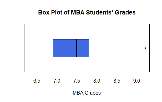
#Five summary statistics and Outliers
boxplot_5_stats = boxplot_grades$stats

rownames(boxplot_5_stats) = c("LCL","Q1","Median","Q3","UCL")
colnames(boxplot_5_stats) = "Five Summary Statistics"

outliers = boxplot_grades$out

print(boxplot_5_stats)
cat("The Outliers are",outliers)
#Output
#Five Summary Statistics
       Five Summary Statistics
LCL                        6.3
Q1                         6.9
Median                     7.5
Q3                         7.8
UCL                        9.1

#Outliers
The Outliers are 9.2
- Boxplot is the most common method to identify outliers. In the above table, the value 9.2 is an outlier since 9.2 > UCL.
Inferences / Take away
- The grades of the students lie between 6.3 and 9.2.
- The Mean and the Standard Deviation of the student’s grades are 7.43 and 0.6.
- There is not much dispersion in the student’s grades.
- The middle 50% of the students are between grade 6.9 to 7.8
- The IQR of the Student’s grade is 0.9
- The top 10% of the students have secured greater than 8.2
- One student has performed exceptionally value with grade of 9.2
Practise Exercise
- Write R Code to create Histogram with Density Plot in the same chart
- Analyze the 12th Standard percentage marks of the MBA Students. (variable name is “ten_plus_2_pct” in the dataset).
Next Blog
In the next blog, let’s learn “Analysis of two variables”:
- One Categorical and other a Continuous variable
- Both Categorical
- Both Continuous
<<< previous | next blog >>>
<<< statistics blog series home >>>
Recent Comments