Analysis of Two Categorical Variables
Crosstab is the most preferred way of analyzing two categorical variables. It helps you to identify the affinity between the two categories. Graphically a Crosstab can be displayed using Stacked Bar Chart.
The Application of crosstab can be best understood by working on sample data. So let’s jump into an example.
Analysis of the MBA Data continued…
For crosstab, we require two categorical variables. Let us analyze the association between MBA Specialization chosen by students and their stream in 12th Standard. The fields in the data file are “mba_specialization” and “ten_plus_2_stream”.
Data Import in Python
# Import the required packages
import pandas as pd
import os
import matplotlib.pyplot as plt
import seaborn as sns

%matplotlib inline
# set directory as per your file folder path
os.chdir("d:/k2analytics/datafile")


# read the file
mba_df = pd.read_csv("MBA_Students_Data.csv")
Crosstab of MBA Specialization vs 12th Standard Stream
Before jumping into the creation of crosstab. Let us quickly do the univariate analysis of both fields.
# Frequency Distribution of MBA Specialization
mba_df["mba_specialization"].value_counts()
Finance               80
Marketing             70
Business Analytics    25
HR                    25
Name: mba_specialization, dtype: int64
# Frequency Distribution of 12th Standard Stream
mba_df["ten_plus_2_stream"].value_counts()
Commerce                             125
Science                               70
Commerce - Information Technology      1
Science - Maths & Biology              1
Diploma in Mechanical Engineering      1
Science - PCM                          1
Computer Science                       1
Name: ten_plus_2_stream, dtype: int64
Data cleaning of stream
We need to do some data cleaning. Recategorize the individual cases into Commerce / Science category.
mba_df['ten_plus_2_stream_recat'] = mba_df['ten_plus_2_stream'].apply(
    lambda x : "Commerce" if ("Commerce" in x ) else "Science")

mba_df["ten_plus_2_stream_recat"].value_counts()
Commerce                             126
Science                               74
Name: ten_plus_2_stream_recat, dtype: int64
Crosstab Analysis
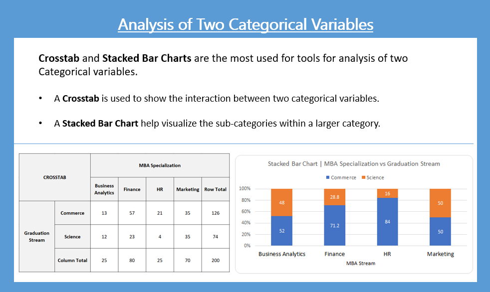
pd.crosstab(mba_df["ten_plus_2_stream_recat"],
            mba_df["mba_specialization"],
            dropna = False,
            margins = True
           )
| mba_specialization | Business Analytics | Finance | HR | Marketing | All |
|---|---|---|---|---|---|
| ten_plus_2_stream_recat | |||||
| Commerce | 13 | 57 | 21 | 35 | 126 |
| Science | 12 | 23 | 4 | 35 | 74 |
| All | 25 | 80 | 25 | 70 | 200 |
From the above crosstab, we observe that there are 57 Commerce students who have taken Finance and likewise, 23 Science students have taken Finance. We can make more such statements but it is not giving any significant insights as such. To get the insight we must convert these numbers into some proportions like Row Proportions or Column Proportions.
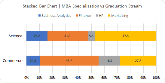
Row Proportions
pd.crosstab(mba_df['ten_plus_2_stream_recat'],
            mba_df['mba_specialization'],
            dropna = False,
            normalize = 'index' # convert absolute to row proportions
           ).round(3)*100
| mba_specialization | Business Analytics | Finance | HR | Marketing |
|---|---|---|---|---|
| ten_plus_2_stream_recat | ||||
| Commerce | 10.3 | 45.2 | 16.7 | 27.8 |
| Science | 16.2 | 31.1 | 5.4 | 47.3 |
Column Proportions
pd.crosstab(mba_df['ten_plus_2_stream_recat'],
            mba_df['mba_specialization'],
            dropna = False,
            normalize = 'columns' # convert absolute to column proportions
           ).round(3)*100
| mba_specialization | Business Analytics | Finance | HR | Marketing |
|---|---|---|---|---|
| ten_plus_2_stream_recat | ||||
| Commerce | 52.0 | 71.2 | 84.0 | 50.0 |
| Science | 48.0 | 28.8 | 16.0 | 50.0 |
Inferences / Take away
Converting the absolute values of crosstab into Row Proportions / Column Proportions provides us more insight into data.
- 47% of Science graduate students prefer to pursue an MBA in Marketing
- 45% of Commerce graduate students have an inclination to pursue MBA in Finance.
- Only 5% of Science Graduate preferred to take HR Specialization in MBA
From the crosstab, it is very clear that Science Students prefer to do MBA Specialization in Marketing and Commerce Students prefer Finance.
Association Analysis
A statistical test called the chi-square test for independence, also called the chi-square test of association, is used on the Crosstab data (Contingency Table) to discover if there is a statistically significant relationship between two categorical variables
Stacked Bar Plot
Crosstab provides a great deal of insight when analyzing two categorical variables. Visually we can represent the crosstab as a Stacked Bar Chart as shown below:
Practise Exercise
Analyze Gender vs Stream of the student in 12th Standard (“gender” variable vs “ten_plus_2_stream”).
Upcoming Blog
In the upcoming blog, we will learn about “Analysis of Two Variables – One Categorical and Other Continuous”
<<< previous | next blog >>>
<<< statistics blog series home >>>
Recent Comments