Bar Plot and Box Plot
When we analyze two variables, one categorical and the other continuous, the objective is often to see the sum or mean of the continuous variables by categories and compare them. Graphically we can display the data using a Bar Plot and/or a Box Plot.
E.x. 1: Geography and Sales – In this case, Geography is the categorical variable and Sales is the continuous variable. We would like to know the sales by geography, as such, we will compute the total sales by geography.
E.x. 2: School and Students Marks – In this case, School is the categorical variable and Student Marks is the continuous variable. We wish to compare 4 schools (say A, B, C, and D) in a city providing Higher Secondary Education based on the marks secured by their students in the 12th standard.
- One way of comparing the schools can be by computing the mean of the percentage of marks secured by students of respective schools. Assume the overall mean percentages of the schools’ A, B, C, and D comes out to be 93.1%, 93.0%, 90%, 80%. From the mean can we say A is a better school compared to B or C just because it has the highest percentage. We may have to also consider Standard Deviation to be able to say whether the difference of 0.1% between A and B is statistically significant to conclude whether A is a better school compared to B based on Students Marks.
Analysis of the MBA Data continued…
Let us consider Graduation Stream and Work Experience from the MBA Data to perform the analysis. The Graduation Stream is our Categorical Variable and the field name in data is “ten_plus_2_stream”. Work Experience is our Continous variable and the field name in data is “work_exp_in_mths”
Data Import in Python
# Import the required packages
import pandas as pd
import os
import matplotlib.pyplot as plt
import seaborn as sns

%matplotlib inline
# set directory as per your file folder path
os.chdir("d:/k2analytics/datafile")


# read the file
mba_df = pd.read_csv("MBA_Students_Data.csv")
Data Preparation
The variable work_exp_in_mth has some missing values. We will replace all the missing values by 0.
mba_df['work_exp_in_mths'].fillna(0, inplace=True)
The variable ten_plus_2_stream has some stray categories. We will replace those values appropriately as Science / Commerce.
mba_df['ten_plus_2_stream_recat'] = mba_df['ten_plus_2_stream'].apply(
    lambda x : "Commerce" if ("Commerce" in x ) else "Science")
We are now set to analyze the data.
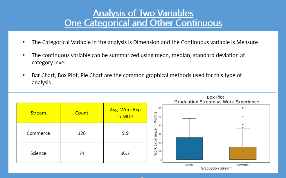
Tabular Report
The easiest way to analyze a categorical and a continuous variable is to create a tabular report. The tabular report of Stream and Work Experience is shown below:
| Stream | Count | Sum Work Exp. (in Mths) |
Avg. Work Exp (in Mths) |
| Commerce | 126 | 1250 | 9.9 |
| Science | 74 | 1237 | 16.7 |
From the above table we can infer:
- The students from the Science stream have more relatively more prior work experience as compared to Commerce students.
- In the above report, the sum of work experience does not make sense. It is very important for the person generating and interpreting the report to understand which aggregation is useful and which is not useful.
Python code for Tabular Report
The python code to aggregate the data is given below. Note: We will not create the sum attribute in our python code.
aggr = mba_df.groupby(['ten_plus_2_stream_recat']).agg(
    {
        'work_exp_in_mths' : ['count','mean']
    }
)


aggr.columns = ["_".join(x) for x in aggr.columns.ravel()]

aggr.reset_index(inplace=True)
aggr.rename(columns={
    "ten_plus_2_stream_recat": "stream",
    "work_exp_in_mths_count": "count",
    "work_exp_in_mths_mean" : "avg_work_exp_in_mths"},
    inplace = True)

aggr["avg_work_exp_in_mths"] = aggr["avg_work_exp_in_mths"].round(1)

aggr
Graphical Method | Box Plot
A box plot can quickly show us the distribution of the continuous variable by categories.
plt.figure(figsize=(9,5))
boxplot = sns.boxplot(
    x = 'ten_plus_2_stream_recat',
    y='work_exp_in_mths',
    data=mba_df, showmeans=True,
    width=0.5,
    palette="colorblind")
plt.title("Box Plot \n Graduation Stream vs Work Experience", fontsize=20)
plt.xlabel('Graduation Stream', fontsize=15)
plt.ylabel('Work Experience in Months', fontsize=15)
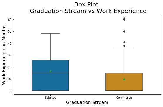
Inferences / Take away
- Prior to pursuing the MBA course, the average experience of Science Students is about 17 months. It is relatively more as compared to the Commerce Students average of 10 months.
- The box plot shows that the third quartile (Q3) of Commerce Students’ work experience is very close to the median of Science Students’ work experience.
- The box plot indicates that there are some outlier work-ex in commerce students’ data. Close observation shows that the value is around 60 months (i.e. 5 years) and it is really not an outlier. Hence it will need not be considered as outliers.
Besides the Box Plot, we can also use Density Plot. However, it may not be as informative as the box plot. I leave this an exercise for the blog reader.
Bar Chart and Pie Chart
Analysis of two variables – One Categorical and the other Continuous using Bar Chart & Pie Chart
A Bar Chart or Pie Chart would be useful in the analysis of two variables, one being categorical and the other continuous only if the continuous variable being analyzed is like Sales, Profit, Bank Balance, etc. where the summation of the measure would make business sense.
Practise Exercise
- Analyze the MBA Specialization with the MBA Grades.
- Analyze the MBA Specialization with the Graduation Percentages.
Upcoming Blog
In the upcoming blog, we will learn “Analysis of Two Categorical Variables”
<<< previous | next blog >>>
<<< statistics blog series home >>>
Recent Comments