Visualization and Pattern Detection is a very important step in Logistic Regression Model development. Visuals create the Wah!!! effect. It helps uncover insights, trends, and patterns from the seemingly huge data by summarizing and pictorially representing the information. The visual insights are very good aid to perform variable transformation and fit a good model on the data.
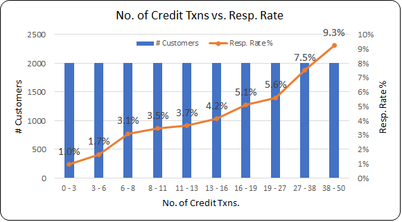
Double Axis Chart for Pattern Detection
The featured image shown above is one of the common types of double-axis charts that many analytics working professionals use to see the relationship between the independent variable and the binomial dependent variable (Target Variable). The binomial target variable has only two possible outcomes like Yes/No, 1/0, Respond/Not-Respond, Default/Not-Default, etc.
The X-axis shows the independent variable. If the independent variable is numerical (continuous) then, it should be converted to categorical by binning/bucketing.
The primary Y-axis is for the number of customers.
The secondary Y-axis is for the Target Rate (Response Rate).
Target Rate is the ratio of the number of customers in the outcome of interest divided by the total number of customers.
Insight from the double-axis chart
The insight from the featured image shown above is: “The Response Rate is observed to increase with the number of transactions. The segments having a high number of credit transactions also show relatively higher response rates”.
For a Data Scientist to be successful, it is important to create these charts for all the independent variables and derive insights from them.
Ln-Odds Chart
The Logistic Regression equation is of the form ln(p / (1-p)) = a + b * x1 where p is the Response Rate (Target Rate) and x1 is the independent variable. The equation is a generalized form of Linear Regression. A scatter plot of Log Odds vs. Independent Variable is prepared to see the linearity.
The log-odds scatter plot of a continuous variable is created by bucketing/binning the continuous variable. The X-axis in the plot shows the average of the bins. The V-axis is the log-odds value.
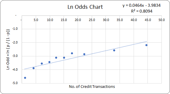
Insight from the Ln-Odds chart
The R-Squared of 0.8 in the above chart shows that there is a very good linear relationship between the independent variable and the log-odds.
Python code to create Interactive Visualizations
You can download the Python code to create the Interactive Double Axis Chart from Github.
Practice Exercise
- The dataset name LR_DF is hardcoded in the code. Modify the code as per your requirement and your dataset name.
- Derive insights for each of the independent variables.
- Note down the variables which do not show Linear Relationship with the Response Rate.
- Think of the variable transformation/feature engineering by which you can change the non-linear trend to linear. This is the topic of our next blog.
Happy Learning !!!
<<< previous blog | next blog >>>
Logistic Regression blog series home
Recent Comments