Classification Accuracy is defined as the number of cases correctly classified by a classifier model divided by the total number of cases. It is specifically used to measure the performance of the classifier model built for unbalanced data. Besides Classification Accuracy, other related popular model performance measures are sensitivity, specificity, precision, recall, and auc-roc curve.
Confusion Matrix & Classification Accuracy Calculation
To calculate the classification accuracy, you have to predict the class using the machine learning model and compare it with the actual class. The predicted and actual class data is represented in a matrix structure as shown below and it is called Confusion Matrix.
| Confusion Matrix | Predicted Class | ||
| Fraud | No Fraud | ||
| Actual Class | Fraud | a | b |
| No Fraud | c | d | |
From the above confusion matrix, we observe:
- the number of observations correctly classified = a + d
- the number of cases wrongly classified = b + c
- total number of observations = a + b + c + d
- Classification Accuracy = (a + d) / (a + b + c + d)
When to use the Classification Accuracy Metric?
The classification accuracy metric should be used only for balanced datasets. Why?
What is Balanced and Unbalanced Dataset in Machine Learning?
Example 1
Assume we are building a machine learning model to predict fraud. The dataset has 99% of the observations as No-Fraud and only 1% Fraud cases. Even without a model, if we classify all cases as No-Fraud, the model classification accuracy would be 99%. In such a scenario, we may preferably use model performance measures like AUC, precision, recall, specificity or F1 Score.
Example 2
You are building a model to predict whether the next working day closing price will be above today’s closing or not. You have collected the last 1 year data of NIFTY stocks. You have classified the outcome as Up & Down.
Up: The closing price of a stock is more than its previous day closing price.
Down: The closing price of a stock is equal to or below its previous day closing price.
In the dataset, the proportion of Up & Down classes is likely to be 50:50. For such a balanced dataset, we use Classification Accuracy as a model performance measure.
Sensitivity, Specificity, Precision, Recall
There are several other metrics like sensitivity (true positive rate), specificity (true negative rate), false positive, false negative, F1 score, precision, recall, and kappa derived from the Confusion Matrix. Let us understand a few of these model performance measures.
Positive: In Classification problems, the phenomenon of our interest is called Positive.
E.g. – In a Fraud Detection Model, we are interested in predicting fraud. The phenomenon of our interest is Fraud, as such, we will use the term Positive for actual fraudulent cases and Negative otherwise.
True Positive: The actual positives correctly predicted as positive is True Positive.
False Positive: Actual Negative, but predicted as Positive is False Positive.
| Confusion Matrix | Predicted Class | ||
| Fraud | No Fraud | ||
| Actual Class | Fraud | a (True Positive) |
b (False Negative) |
| No Fraud | c (False Positive) |
d (True Negative) |
|
Total Positive = a + b
Total Negative = c + d
Sensitivity (True Positive Rate): the proportion of actual positives that are correctly identified.
Recall is the other terminology used for Sensitivity.
Sensitivity = Recall = a / (a + b)
Specificity (True Negative Rate): the proportion of actual negatives that are correctly identified.
Specificity = d / (c + d)
Precision: the proportion of true positives out of the total predicted positives.
Precision = a / (a + c)
AUC-ROC Curve
AUC-ROC Curve stands for Area Under Curve – Receiver Operating Characteristics Curve.
ROC curve is a graphical plot that illustrates the diagnostic ability of a binary classifier system as its discrimination threshold is varied. The discrimination threshold in the ROC curve definition refers to probability, the output of a binary classifier model. The steps to plot the ROC Curve are:
- Decide a threshold cut-off
- Classify the outcome to be POSITIVE or NEGATIVE. If the predicted probability is above the threshold cut-off then POSITIVE else NEGATIVE.
- Calculate Sensitivity and Specificity
- Repeat the steps 1 to 3 at least 15 to 20 times by varying the threshold between 0 to 1.
- Plot the graph of Sensitivity vs (1 – Specificity). Sensitivity be on Y-axis and (1 – Specificity) on X-axis. This plot is ROC Curve.
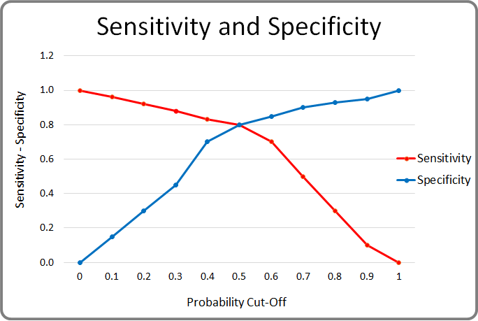
Let us say, we consider the threshold cut-off to be 0. If the predicted probability is greater than or equal to 0 then Positive else Negative. In this case, all observations will be classified as Positive. The Sensitivity (Recall) of the binary classifier model will be 1 and Specificity will be 0.
On the other extreme, if we consider the threshold cut-off to be 1. If the predicted probability is greater than 1 then Positive else Negative. Probability cannot be more than 1, as such, all the observations will be classified as Negative. The Specificity (True Negative Rate) of the model will be 1 and Sensitivity (True Positive Rate) will be 0.
Sensitivity and Specificity varies between 0 to 1 depending on the cut-off. See the chart below.
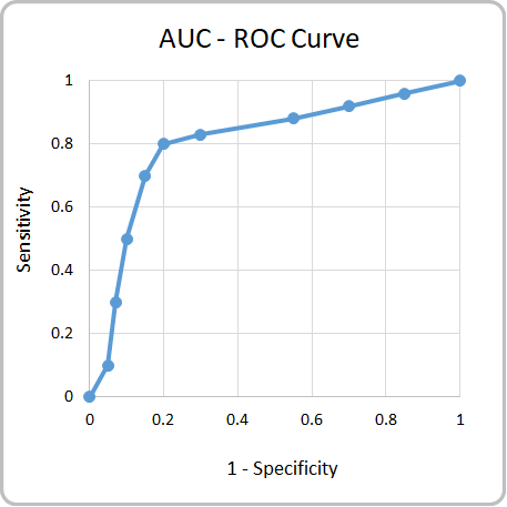
Receiver Operating Characteristics (ROC) curve is a plot between Sensitivity (TPR) on the Y-axis and (1 – Specificity) on the X-axis. Shown below is the ROC Curve. The total area of the square in the plot = 1 * 1 = 1.
Area Under Curve (AUC) is the proportion of area below the ROC Curve (blue curve in the graph shown below).
AUC Interpretation
The value of AUC ranges from 0 to 1. The table below explains the interpretation of AUC value.
| AUC Interpretation | |
| AUC Value | Interpretation |
| >= 0.9 | Excellent Model |
| 0.8 to 0.9 | Good Model |
| 0.7 to 0.8 | Fair Model |
| 0.6 to 0.7 | Poor Model |
| <0.6 | Very Poor Model |
AUC Code in Python & R
AUC-ROC
from sklearn.metrics import roc_curve
import matplotlib.pyplot as plt
%matplotlib inline
fpr, tpr, thresholds = roc_curve(dev["Target"],dev["prob"] )
plt.figure(figsize=(9,5))
plt.plot([0, 1], [0, 1], 'k--', label = 'Random')
plt.plot(fpr, tpr, color = 'blue', label = 'ROC')
plt.xlabel('False Positive Rate', fontsize=15)
plt.ylabel('True Positive Rate', fontsize=15)
plt.title('ROC Curve', fontsize=20)
plt.legend(fontsize=10, loc='best')
plt.show()
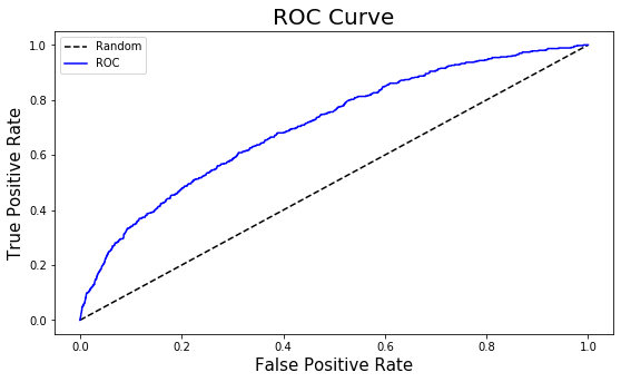
from sklearn.metrics import  auc
roc_auc = round(auc(fpr, tpr), 3)

KS = round((tpr - fpr).max(), 3)


print("AUC of the model is:", roc_auc)
print("KS of the model is:", KS)
AUC of the model is: 0.707
KS of the model is: 0.297
The AUC of the model is 0.70. Based on AUC interpretation, the model may be considered to be a poor or just fair model.
Related reading – We recommend reading the Wikipedia article on the Confusion Matrix.
<<< previous blog | next blog >>>
Logistic Regression blog series home
Recent Comments